MY ROLE_ Product Designer
DURATION_
10 weeks (2021)
WHAT I DID_Design system
UX research
UI/Interaction design
OVERVIEW_The Bellevue Badminton Club(BBC) is a leader in the badminton community both locally and nationally. Founded in 2005, BBC has owned over 5000 members across 4 locations in the Great Seattle area. The club’s website mainly serves as a channel to display the club’s information, members to rent court and sign up for events. This project focused on redesigning the Bellevue Badminton Club’s (BBC) website to make it easier for users to find information, book courts, and sign up for memberships — while supporting business goals around reduced inquiries and increased conversions.
BUSINESS GOAL_
- Increase new member sign-ups by 15%
- Reduce basic questions that should be answered online
USERS GOALS_
- Easily find how to reserve a court
- Understand pricing, membership, and play options
CONSTRAINTS_
- Technical constraints with embedded third-party booking systems
- Limited timeline for priority redesign goals
RESEARCH & DISCOVERY
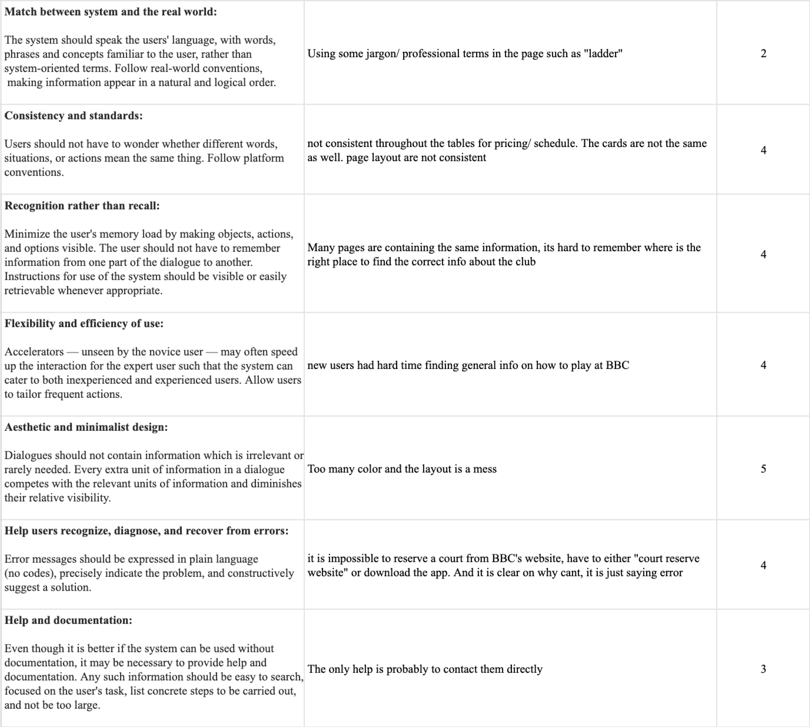
Heuristic Evaluation - Found inconsistency, not speaking user’s language, and redundant information

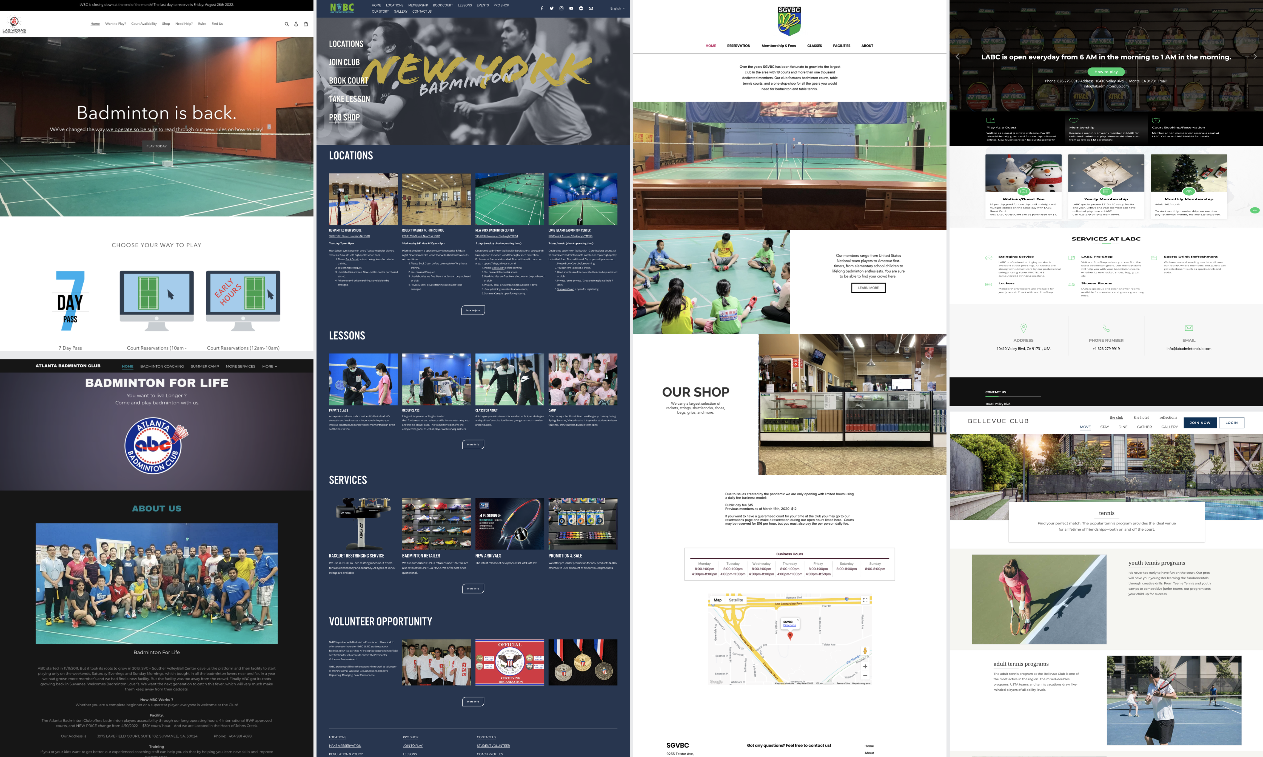
Competitors Analysis - Analyzed 4 sites and collected best practice on visual representing pricing, book court and membership sign up, etc...
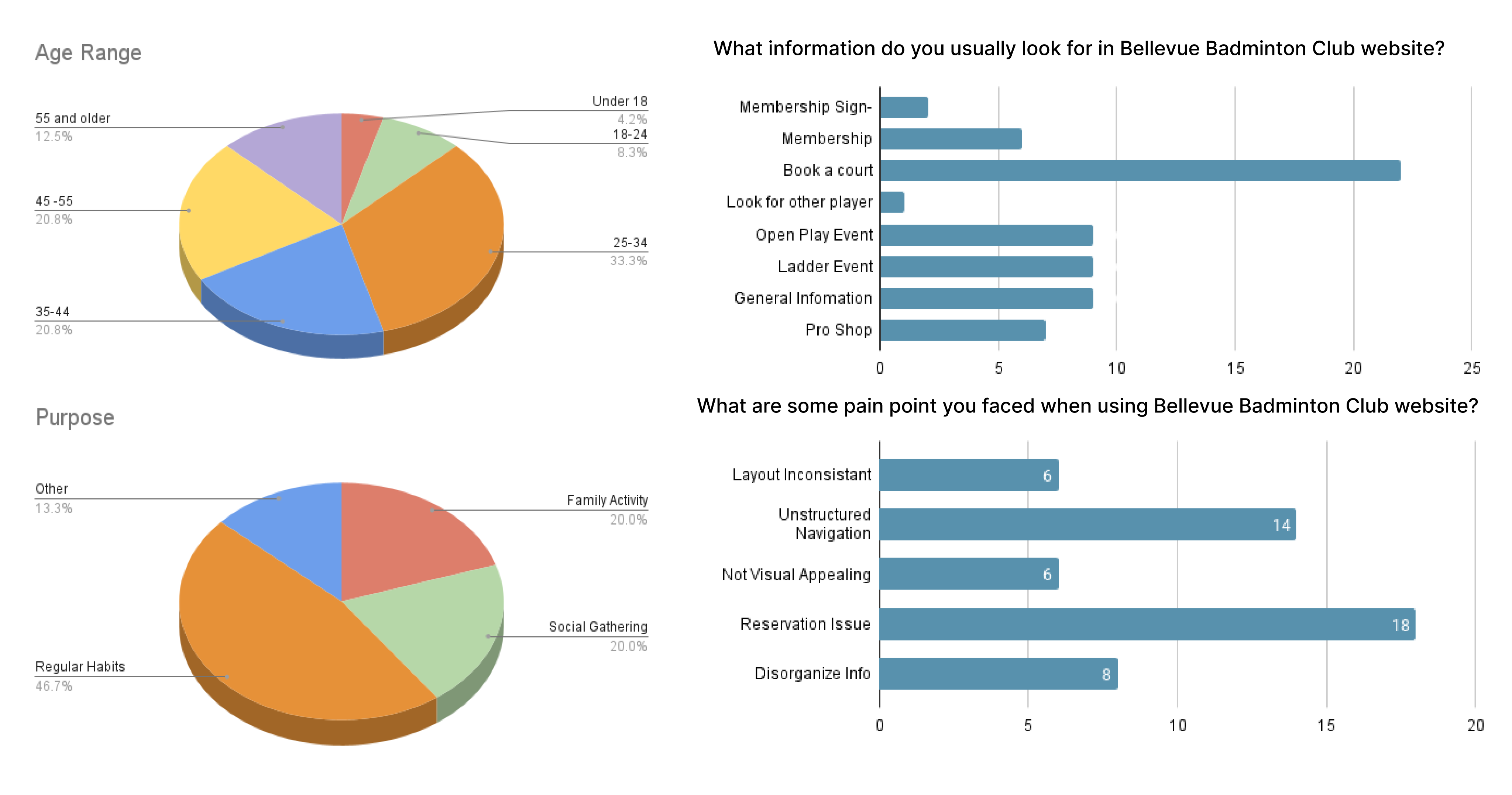
Online Survey - Collected 27 demographic (new and existing member) survey result, members struggled most with court booking and finding information.
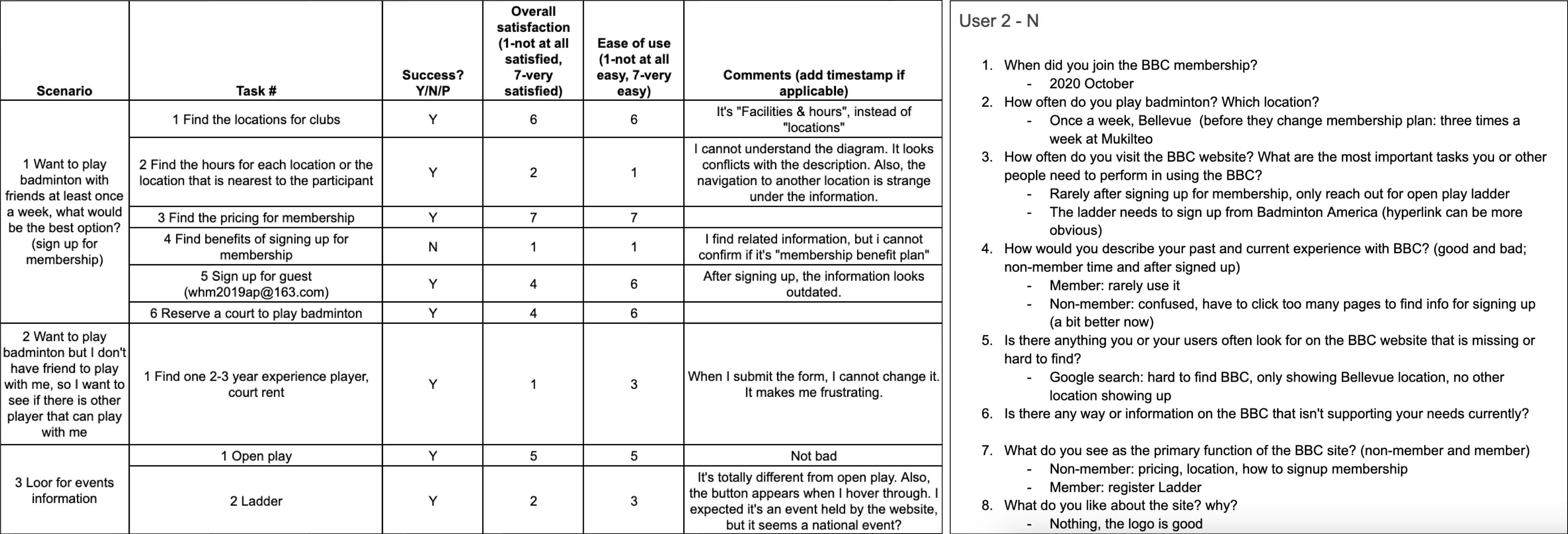
User interviews (8 total) & usability testing: Confirmed that unclear membership details and confusing navigation led to inquiries and abandonment.
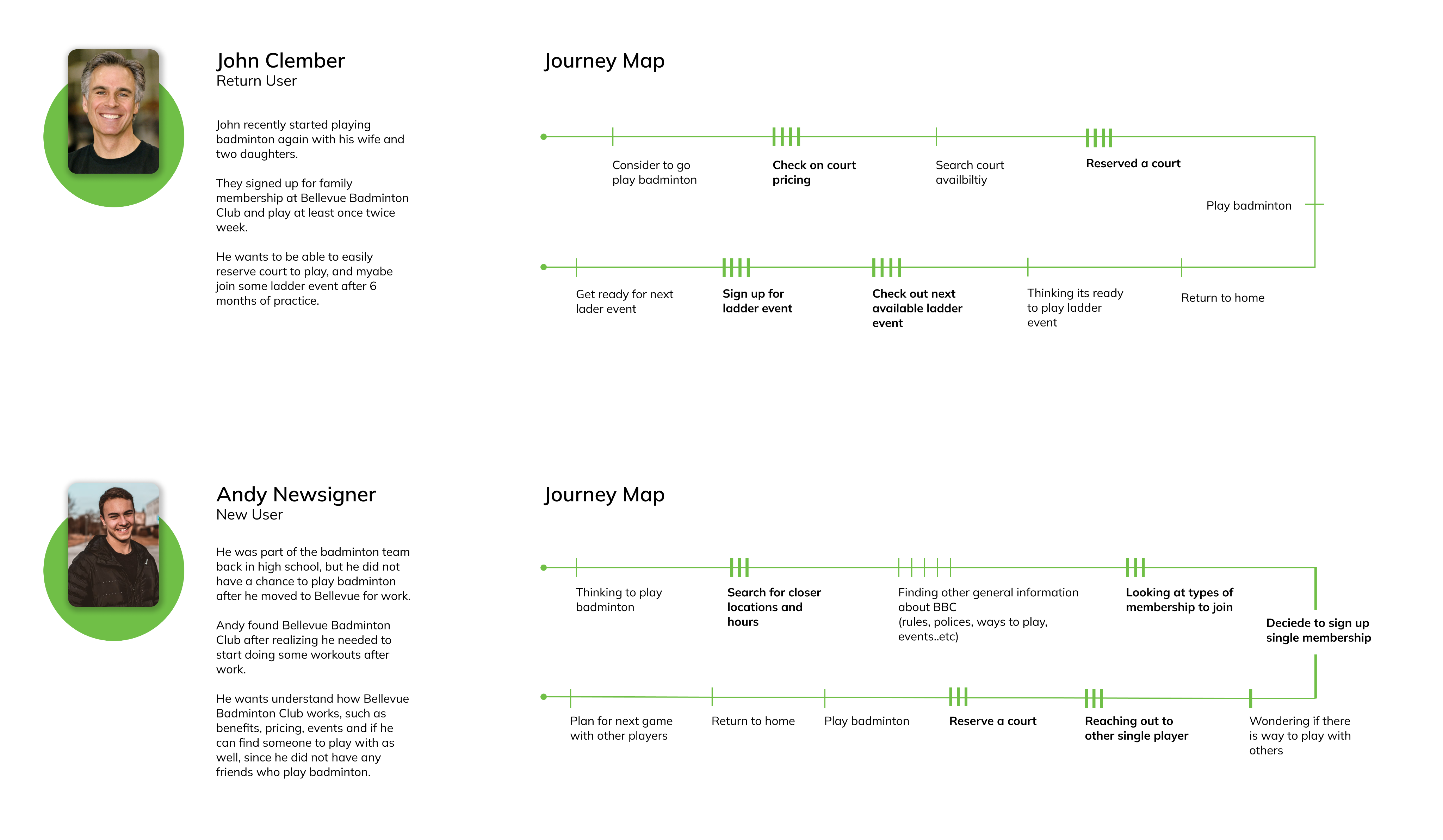
DEFINE_I developed user personas and journey maps to identify key friction points and moments of drop-off across the experience, helping guide design decisions toward clearer, more intuitive flows
To simplify the site structure and align it with users’ mental models, I conducted card sorting to better understand how users categorize information and prioritize their needs.
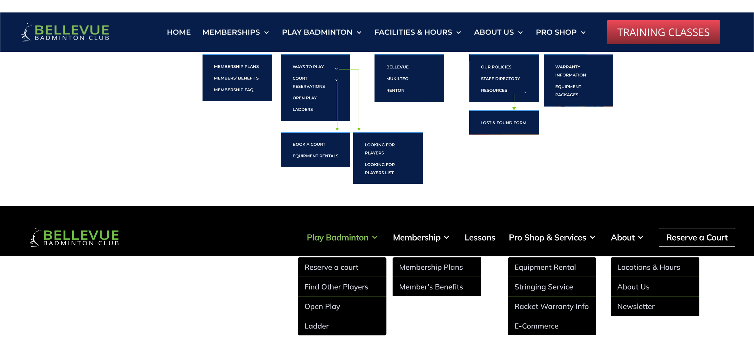
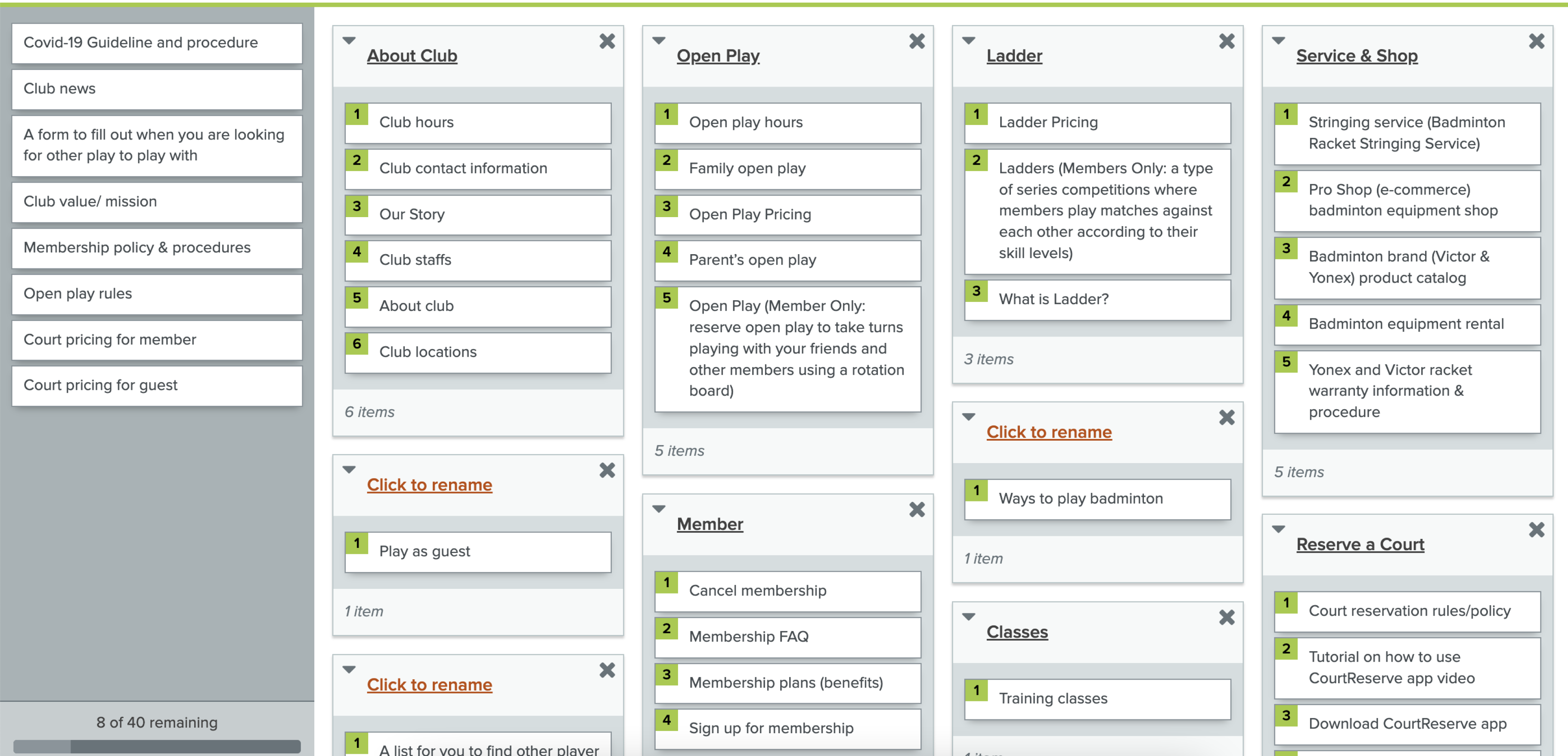
Many pages/content could be grouped under the same categories
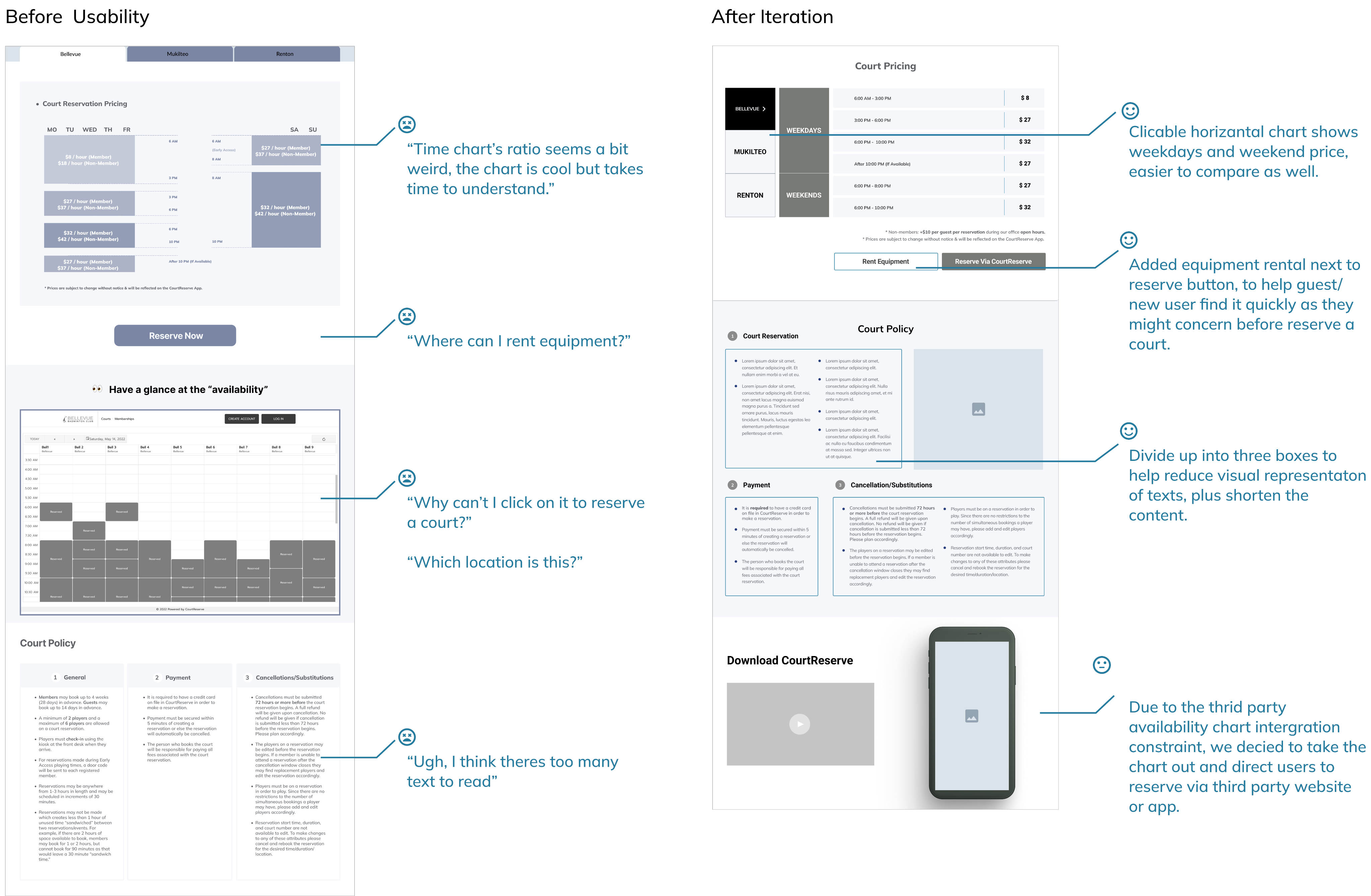
USABILITY TESTING & ITERATION_
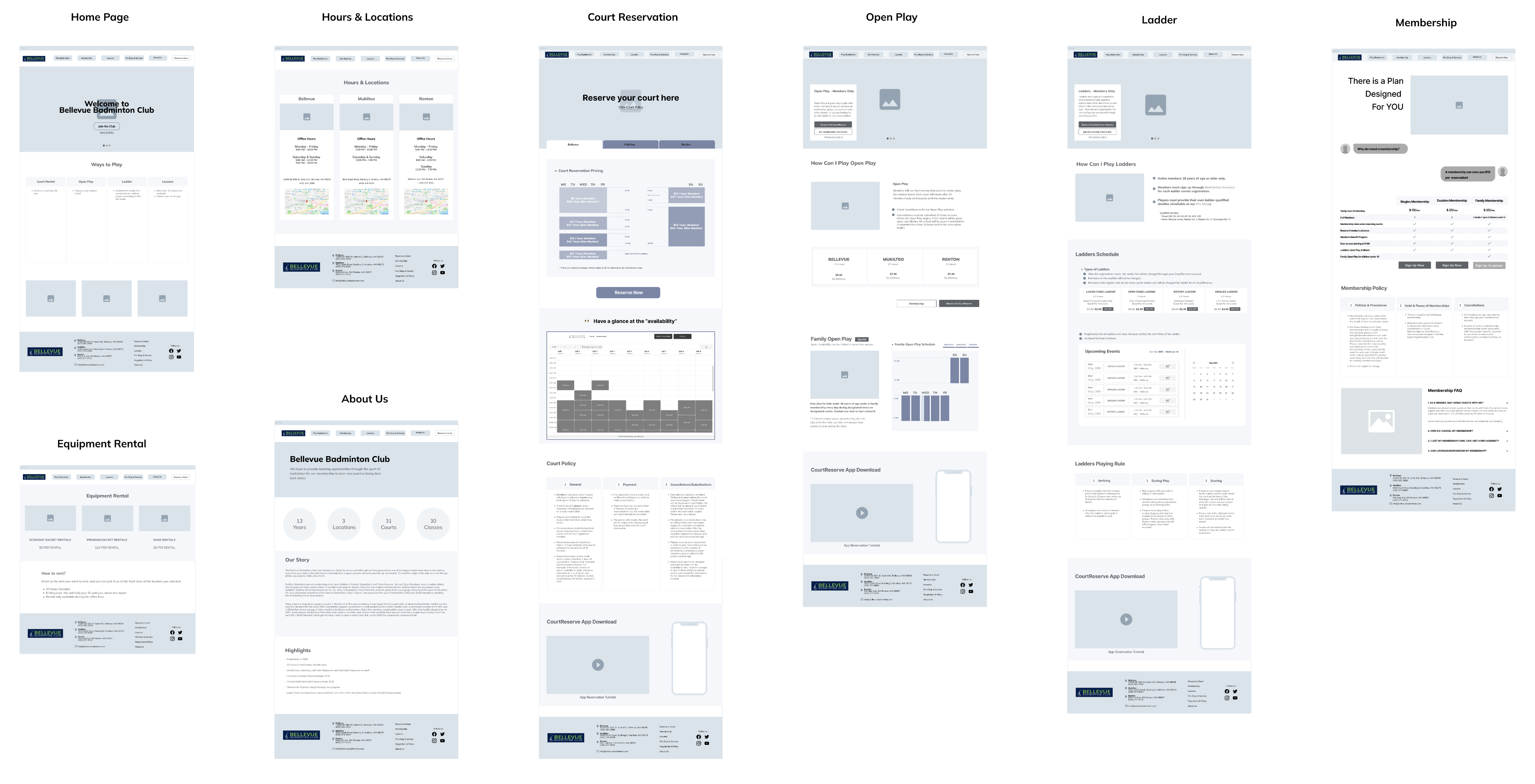
New information architecture and Low fidelity screens are made, to check if the screens are according to users’ mental model or not, we conducted 8 usability testing sessions. Research Questions:
- Can users easily find information they need for playing at Bellevue Badminton Club or sign-up membership?
- Are the new chart of displaying pricing easier to understand?
- Are users able to efficiently reserve a court or ladder event?
Success Metric 1
- Time on Task
Success Metric 2
- No Error Performed
Success Metric 3
- Task Level Satisfaction

Example Iteration: Court Rental & Price Information Iteration
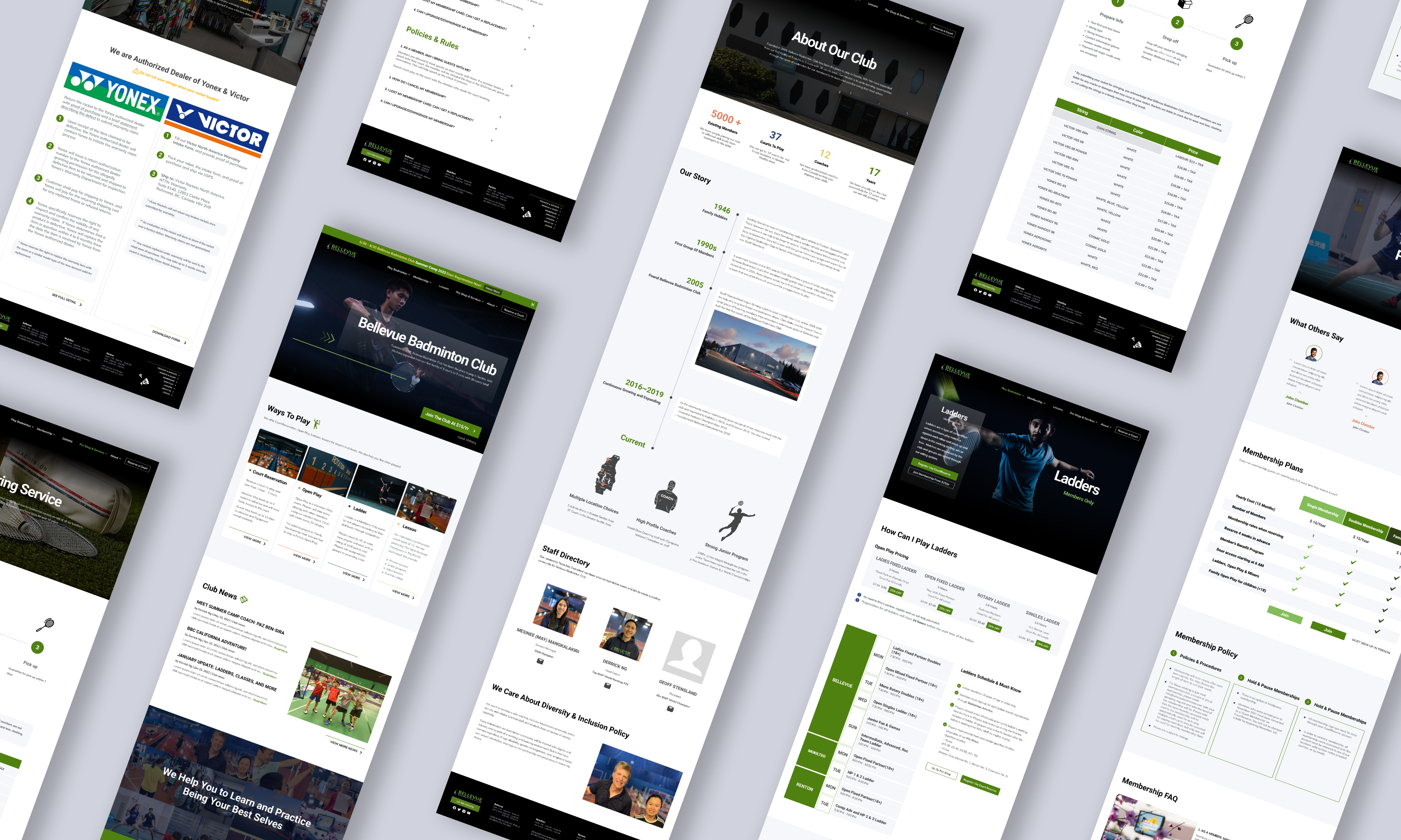
FINAL DESIGN_
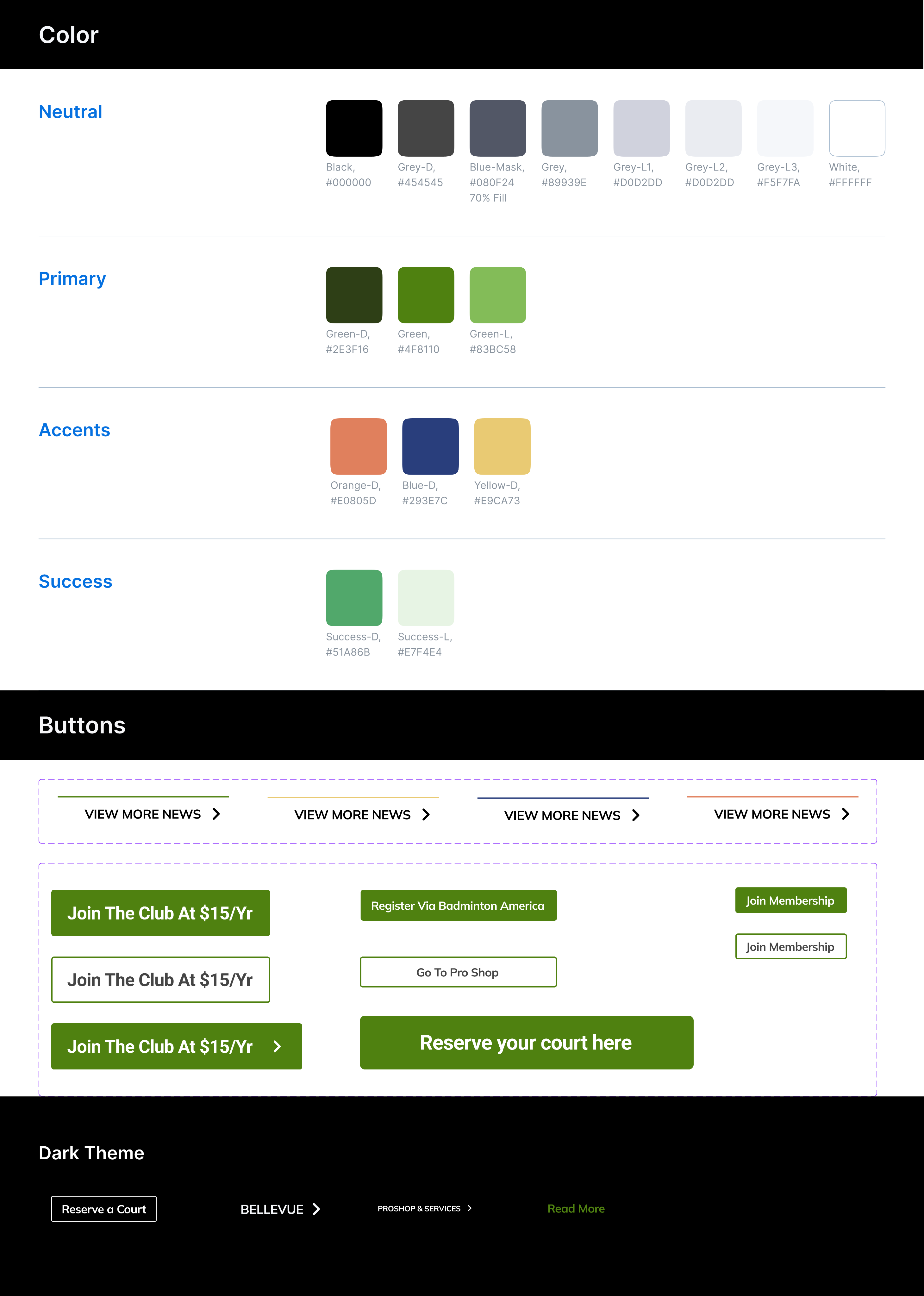
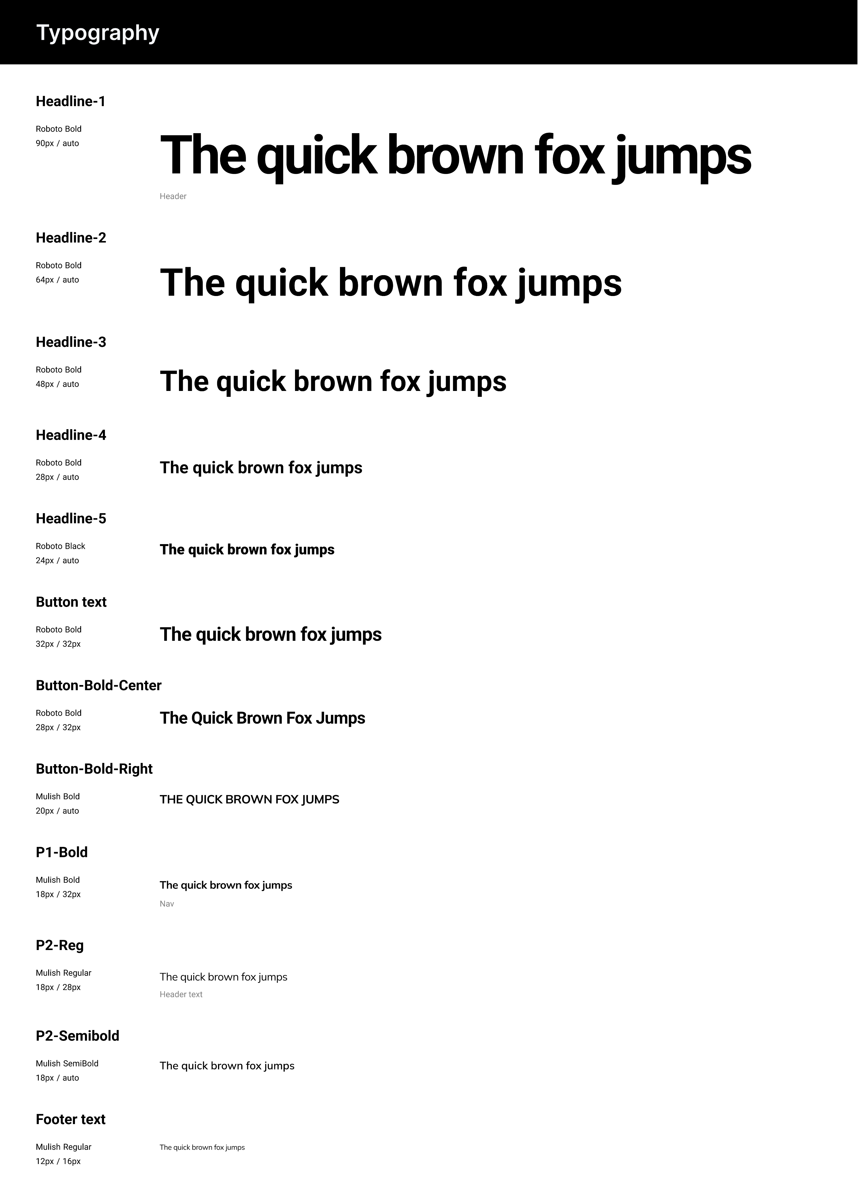
To establish a cohesive design system, we aligned the visual direction with Bellevue Badminton Club’s existing brand and validated it through a stakeholder brand survey. The survey clarified key brand tenets — Inclusive, Professional, and Bonding — which directly informed our color palette, typography, and overall visual language.
RESULT & IMPACT_
The redesigned experience and system were delivered to stakeholders and received strong positive feedback, particularly for simplifying the information architecture and improving clarity across key user flows.
One year after implementation, performance metrics showed measurable business impact:
- 20% reduction in support calls
- 56% increase in membership sign-ups
These outcomes demonstrate how aligning user needs with business goals can improve both operational efficiency and conversion performance.