BACKGROUND_The FPAC Web Modernization Program unified four USDA farmer-facing agency websites into a more consistent, user-centered experience on modern Drupal platforms. Three agencies (FSA, RMA, and FPAC-BC) underwent full redesigns and migrations, while NRCS received targeted improvements — creating a stronger, more cohesive digital foundation for farmers and staff.
MY ROLE_ UI/UX Designer
DESIGN TEAM_
UX Lead
Content Strategist
UX designer
UI/UX Designer
WHAT I DID_Analyze Data & Report
Assist in User & Stakeholder Interviews
Lo/Hi-Fi Wireframes
Design System
Visual QA
JUMP TO
THE CHALLENGE_The platforms supported multiple agencies, complex policy documentation, and diverse user groups — from producers and farmer to internal program specialists. As new features and content types were introduced, interaction patterns began evolving independently.
This created a natural inflection point:
- Document-heavy experiences required stronger hierarchy and structure
- Interaction patterns varied across platforms
- Accessibility needed to be consistently embedded across implementations
- Duplicating content with no shared structure or workflow between each agencies
“The website is difficult to use. There’s too much jargon and not enough plain language for new farmers.”
— Sustainable farmer, Wisconsin (FSA Website Interview, 2023)
Rather than correcting something broken, the challenge was to align and extend — strengthening the foundation so the ecosystem could support long-term growth.
INITIAL RESEARCH & FINDINGS_We do all the research - stakeholder interview, user interview, content audit, information architecture, GA analysis planning for each agency before we start actual design process. This help us to understand each site’s goal, audience and the pain points from internal plus end user.
For example of end user:
- RMA: Approved insurance providers -who sell crop insurance
- FSA: Farmers and producers - find programs to secure and grow their operations
- NRCS: Farmers, ranchers, and forester - look for plan and fund conservation
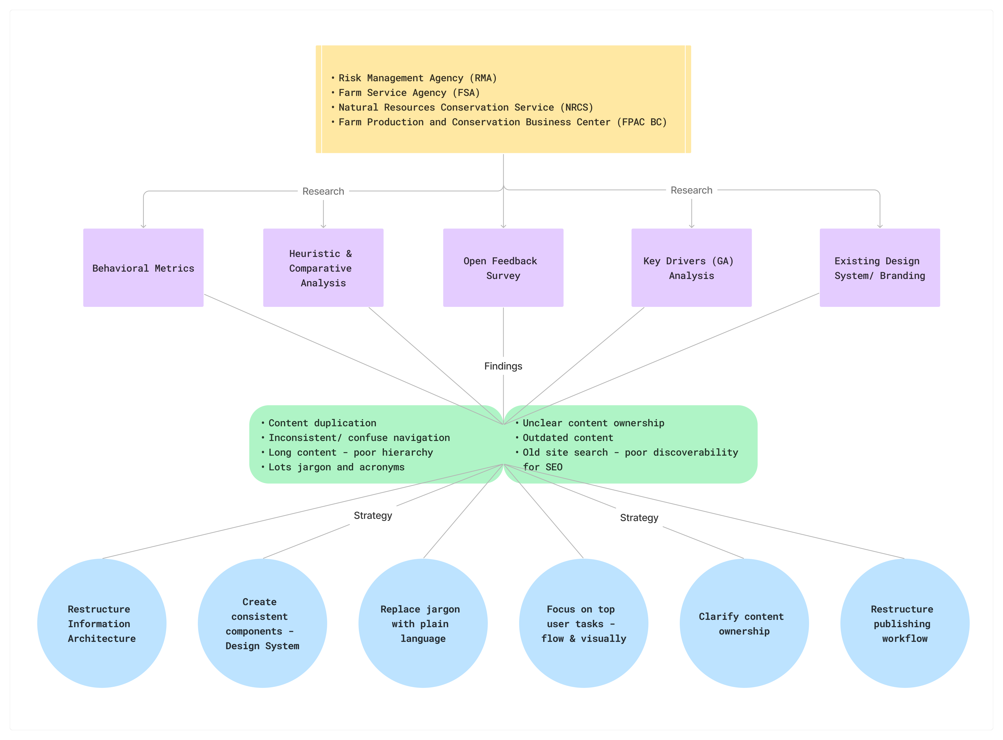
CONTENT & INFORMATION ARCHITECTURE_Our initial content inventory revealed tens of thousands of pages across each site, highlighting the scale and complexity of the content ecosystem. We audited the inventory to identify duplicate and overlapping content, and routed unclear items to subject matter experts for review.
These insights informed a new information architecture aligned with farmers’ mental models. We validated and refined the structure through two rounds of tree testing, ensuring users could quickly find the content they needed.
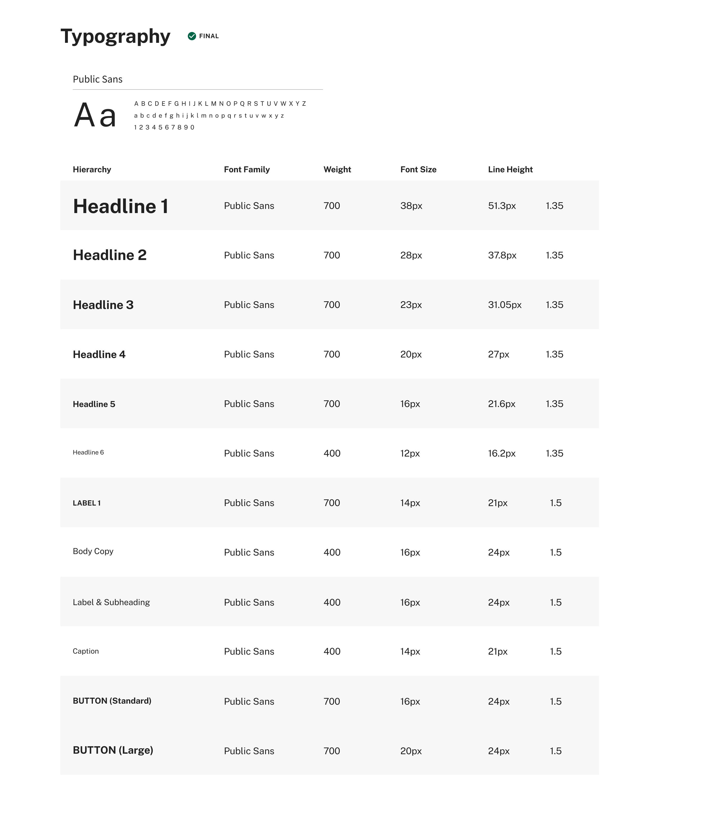
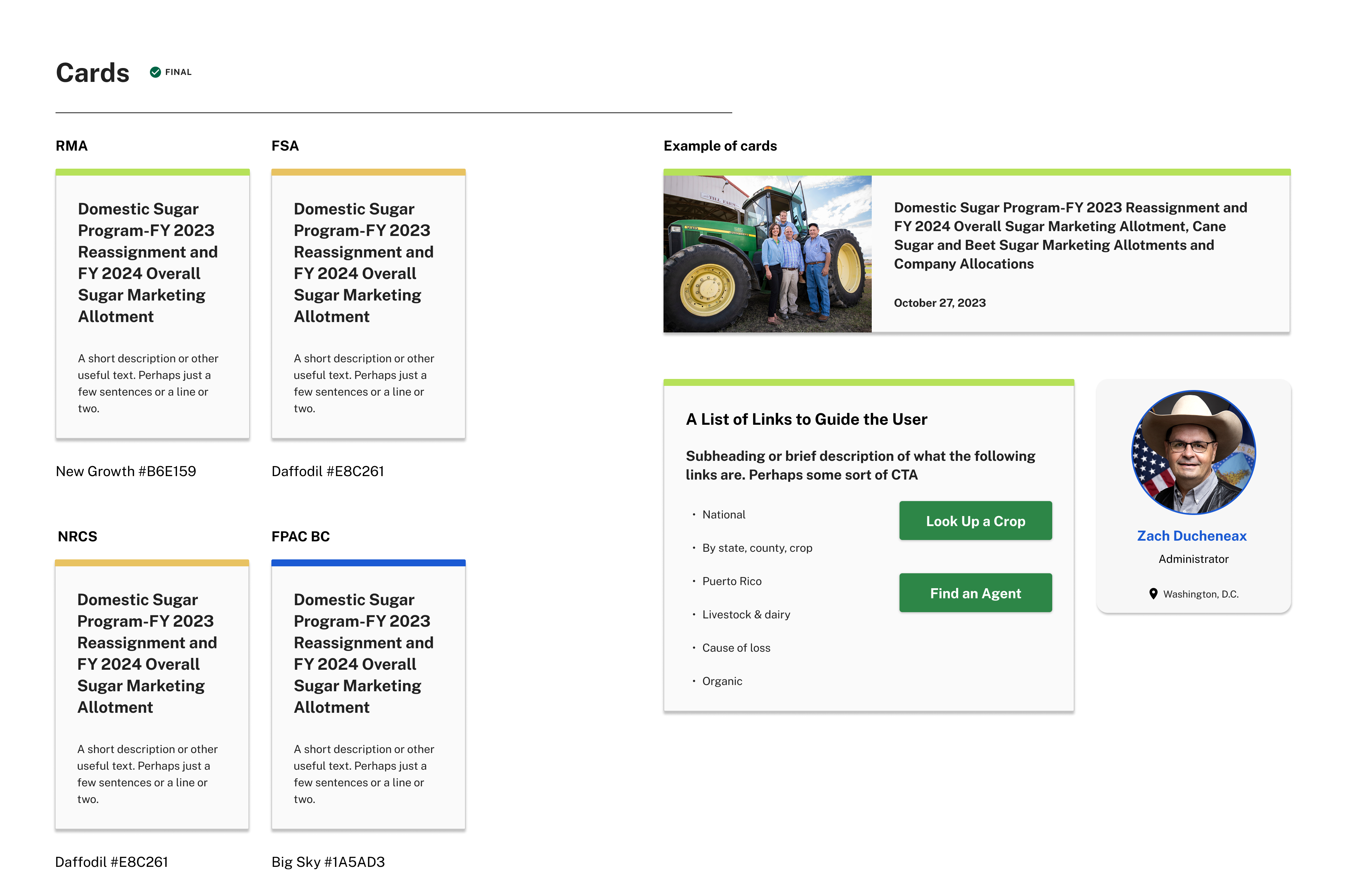
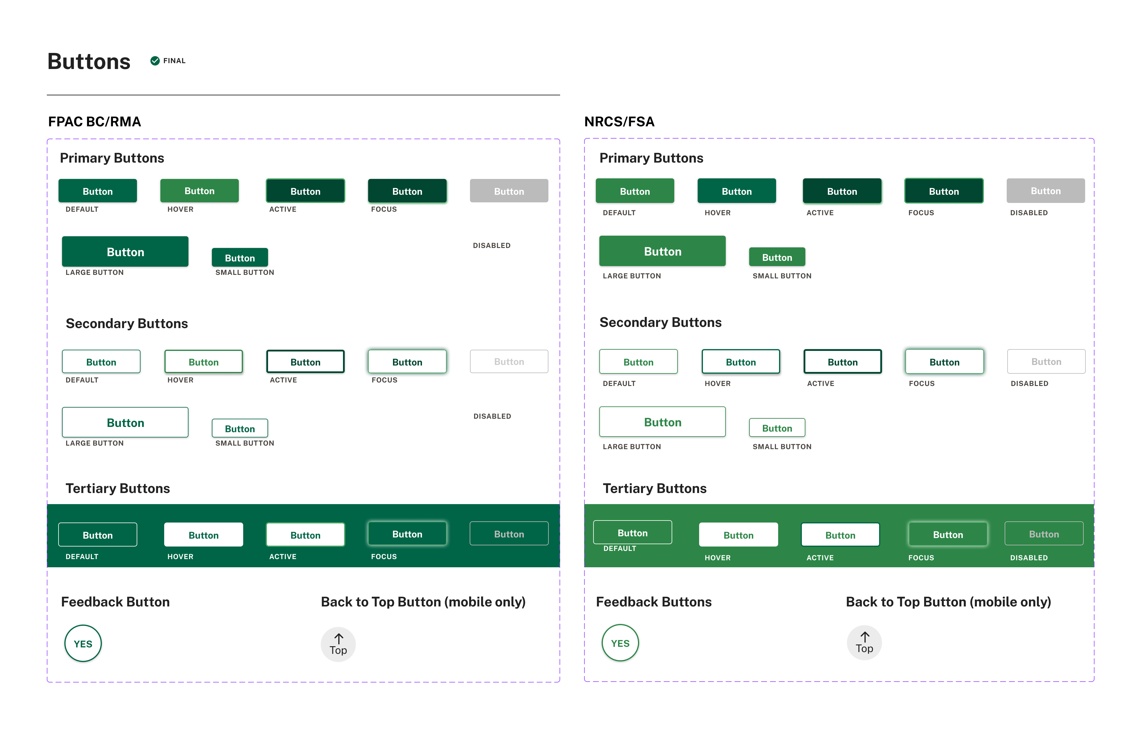
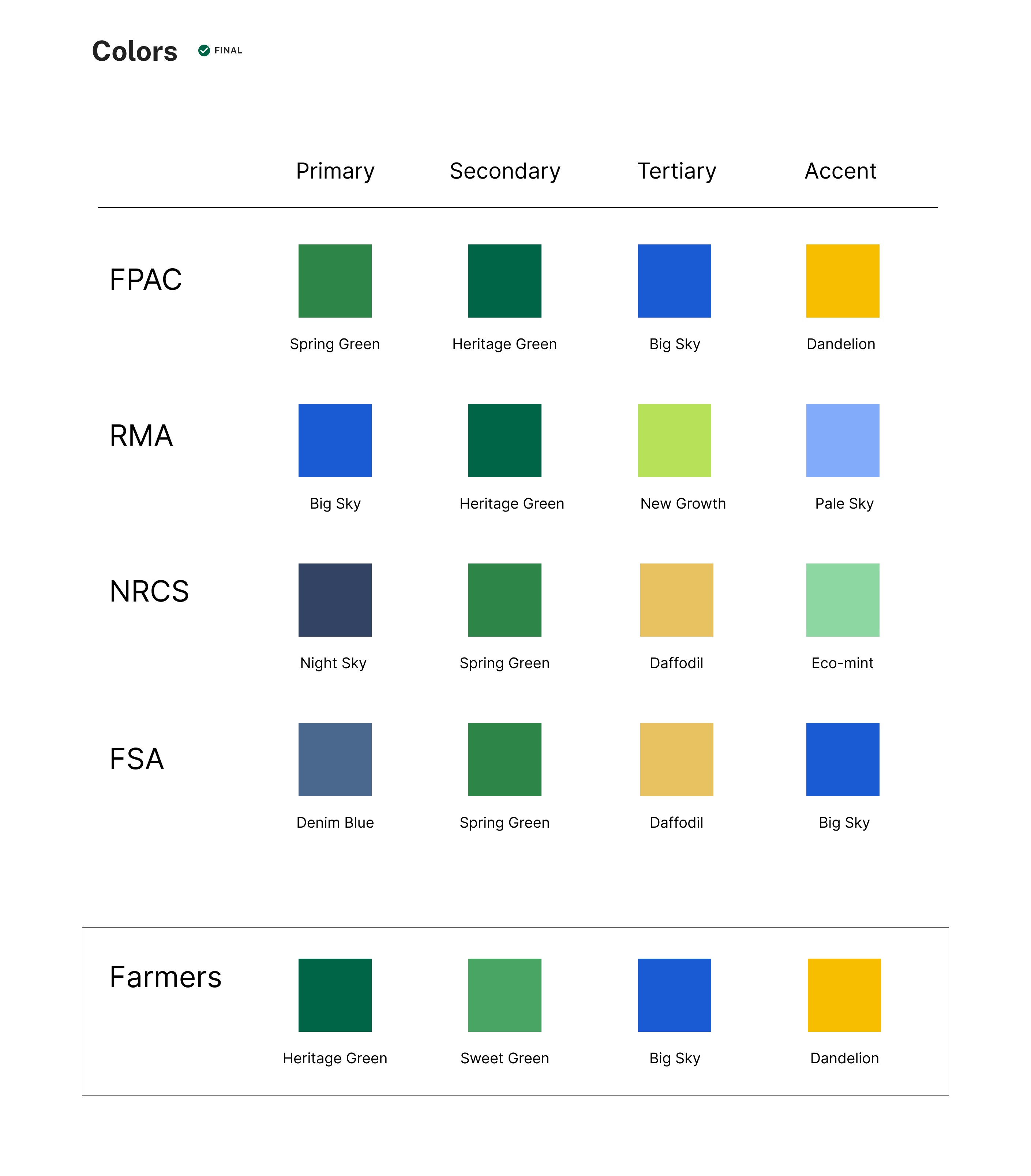
DESIGN SYSTEM_To support consistency across the ecosystem, I led much of the work in organizing and extending the design system using the U.S. Web Design System (USWDS) as the foundation.
I began by evaluating which USWDS components and tokens could be directly adopted and where additional patterns were needed for FPAC’s document-heavy interfaces.
My work included structuring the design system in Figma and organizing them into a clear, maintainable library for designers and developers. I also created additional components that aligns with WCAG 2.0 AA— including cards, side navigation, and status indicators — to better support structured content and.
The result was a scalable design foundation that allowed teams across FPAC to build with greater consistency, clarity, and accessibility.
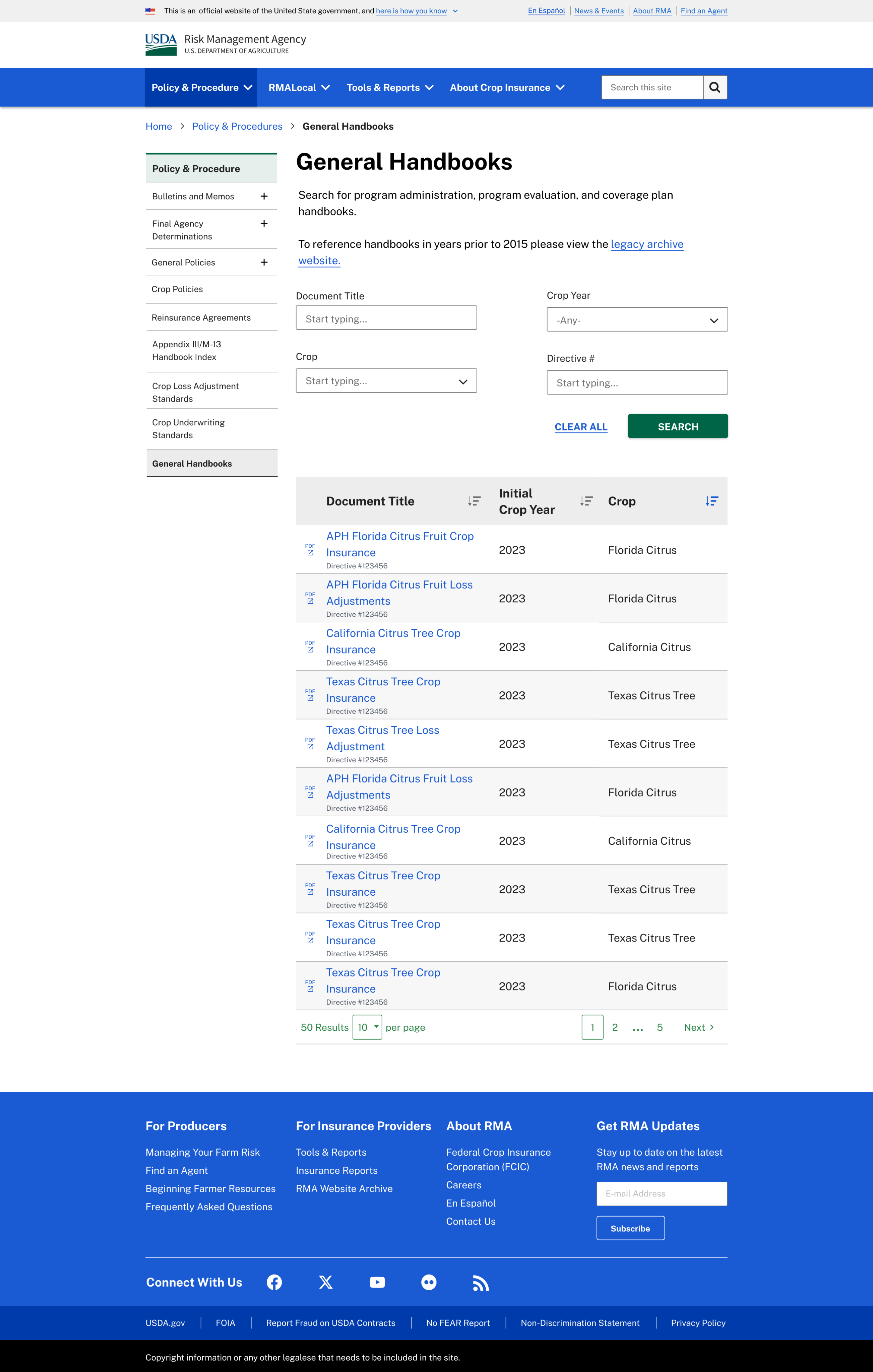
RMA’s DOCUMENT ECOSYSTEM__RMA’s policy and handbook ecosystem contains a large volume of structured documents — each with metadata such as document numbers, effective dates, categories, and status indicators.
Through research and platform audits, we observed that users relied heavily on this metadata when locating policy materials. However, the interface needed stronger hierarchy to support scanning and comparison across documents.
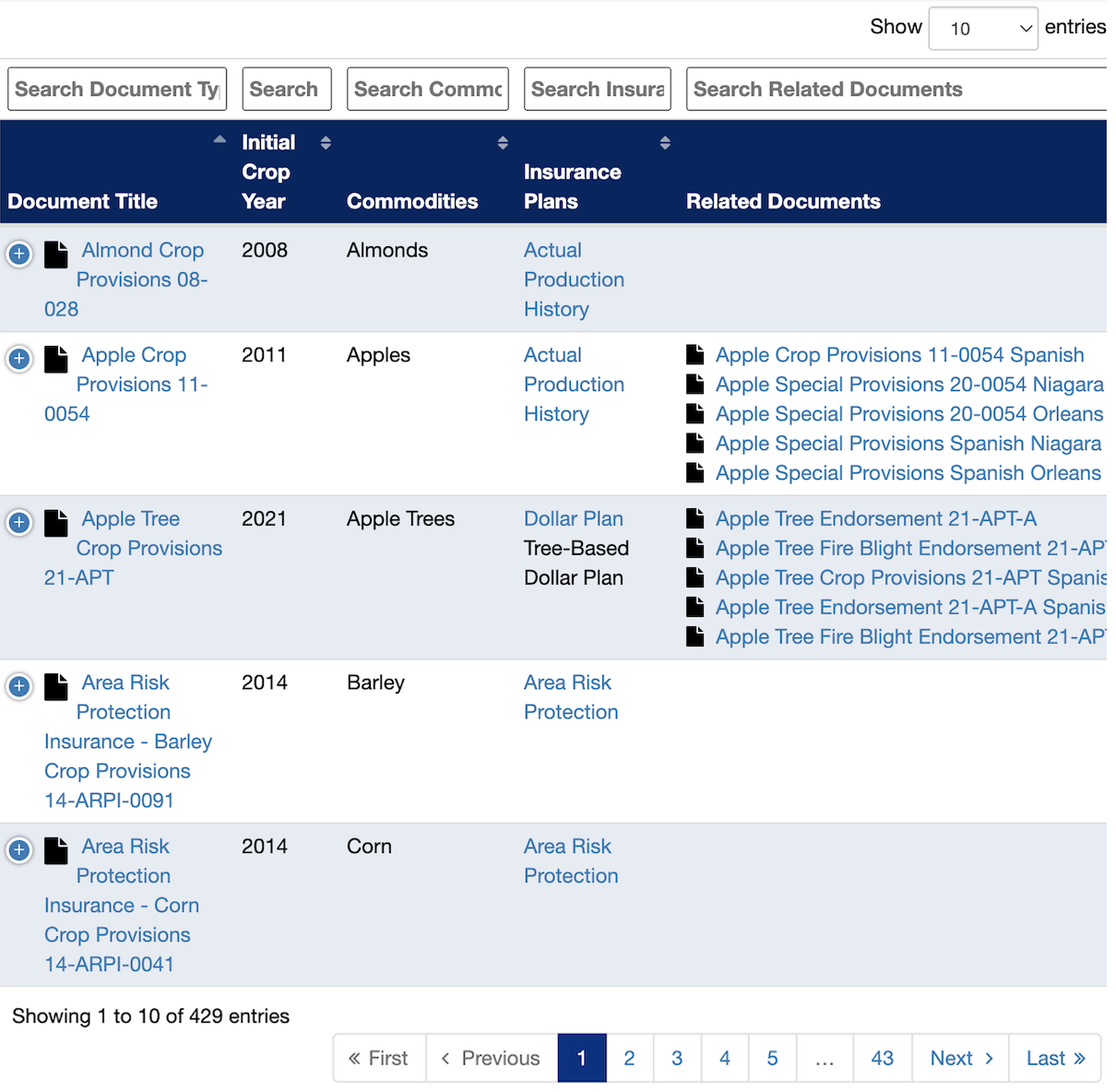
Old RMA data table
New design - new color, IA and data table
EXPERIENCE DESIGN_Instead of simplifying the information, we focused on clarifying its structure. Reducing effort and increasing confidence in document retrieval, we designed search-driven workflows, prioritizing the information users referenced most often when browsing policy documents.
Key improvements included:
- Establishing a clear column hierarchy
- Improving scanability through spacing and typography
- Designing accessible sorting behaviors
- Supporting filtering patterns aligned with user workflows
These updates were incorporated into the design system , allowing the table pattern to be reused across other document-driven experiences.

New design - new color, IA and data table
THE CURVEBALL/CONSTRAINTS_
During discovery and stakeholder interviews, we identified opportunities to improve how users navigate RMA’s policy and handbook content—particularly around filtering, metadata structure, and document discovery. However, in the final weeks before launch stakeholders were cautious about introducing major structural changes due to challenges experienced in previous redesigns.
The decision to retain the legacy filtering model rather than implement the proposed enhancements. While we shared supporting research and potential user impacts, we aligned with stakeholder direction. Despite these constraints, several improvements were still implemented, including a clearer information architecture, plain-language updates, and a redesigned data table interface.
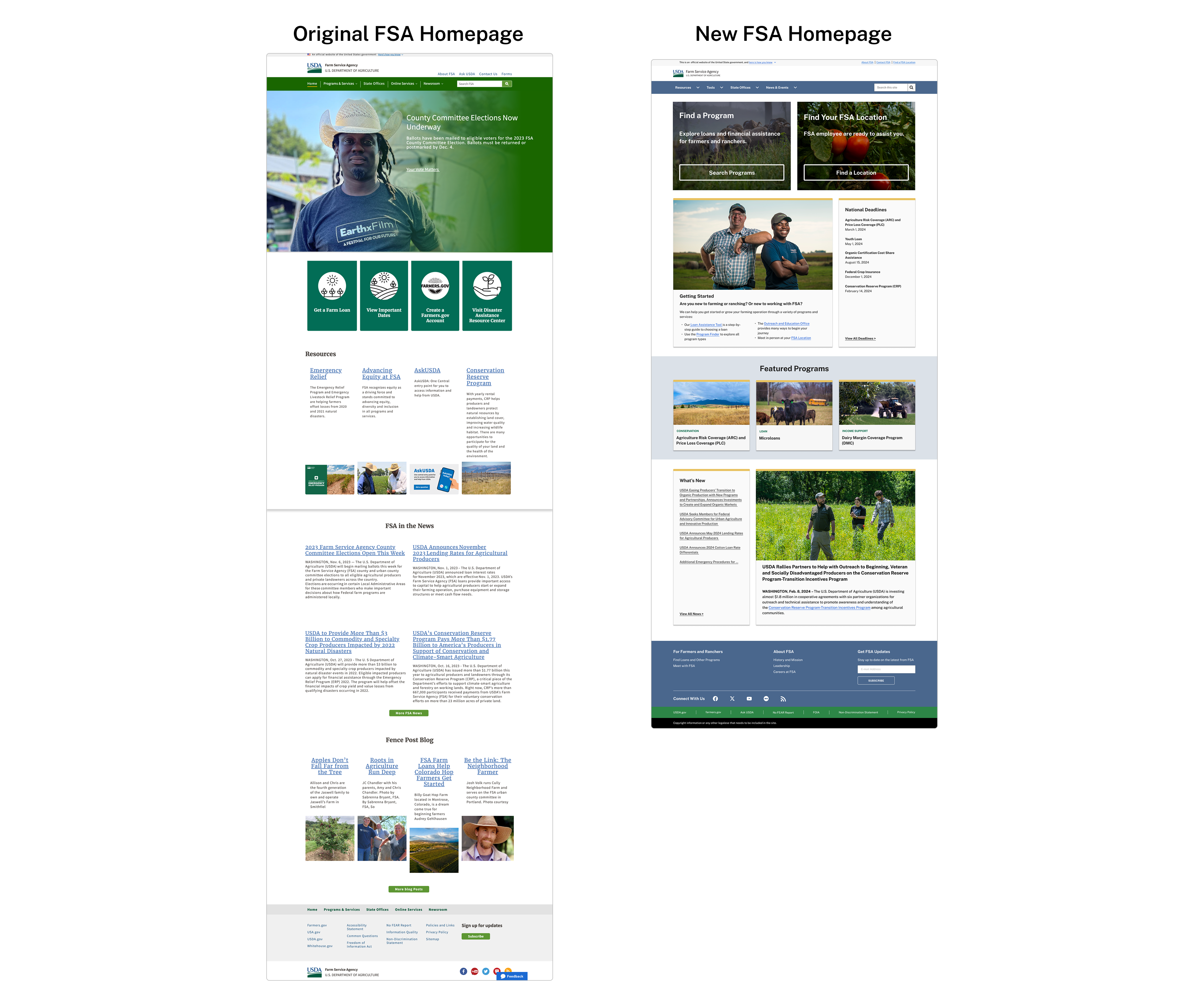
FSA HOMEPAGE REDESIGN_
The FSA homepage was redesigned to help farmers more easily find relevant programs and resources. The previous homepage was dense, difficult to scan, and largely organized around internal agency structure rather than user needs.
Drawing from insights gathered during our content audit and IA research, we restructured the homepage around key farmer tasks and high-demand program categories. The redesign prioritized clearer hierarchy, improved scanability, and faster access to essential information.
RESEARCH & EVALUATION_The FSA homepage was redesigned to help farmers more easily find relevant programs and resources. The previous homepage was dense, difficult to scan, and largely organized around internal agency structure rather than user needs.
Drawing from insights gathered during our content audit and IA research, we restructured the homepage around key farmer tasks and high-demand program categories. The redesign prioritized clearer hierarchy, improved scanability, and faster access to essential information.
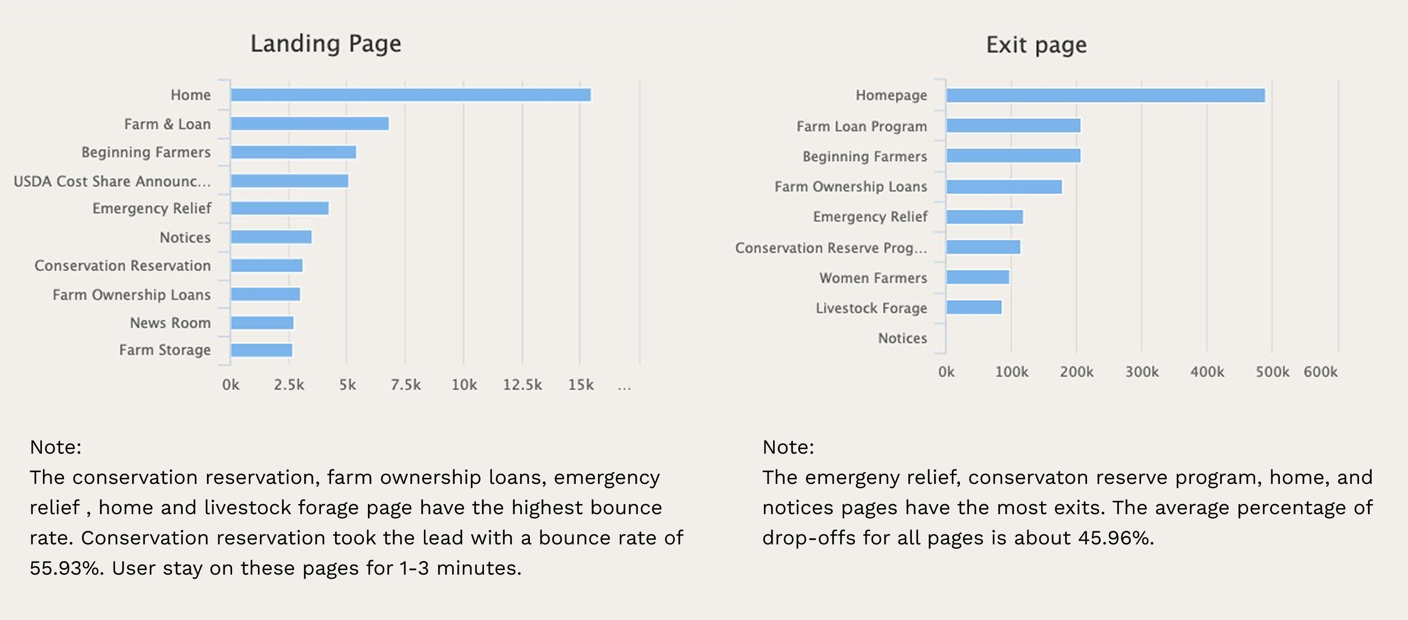
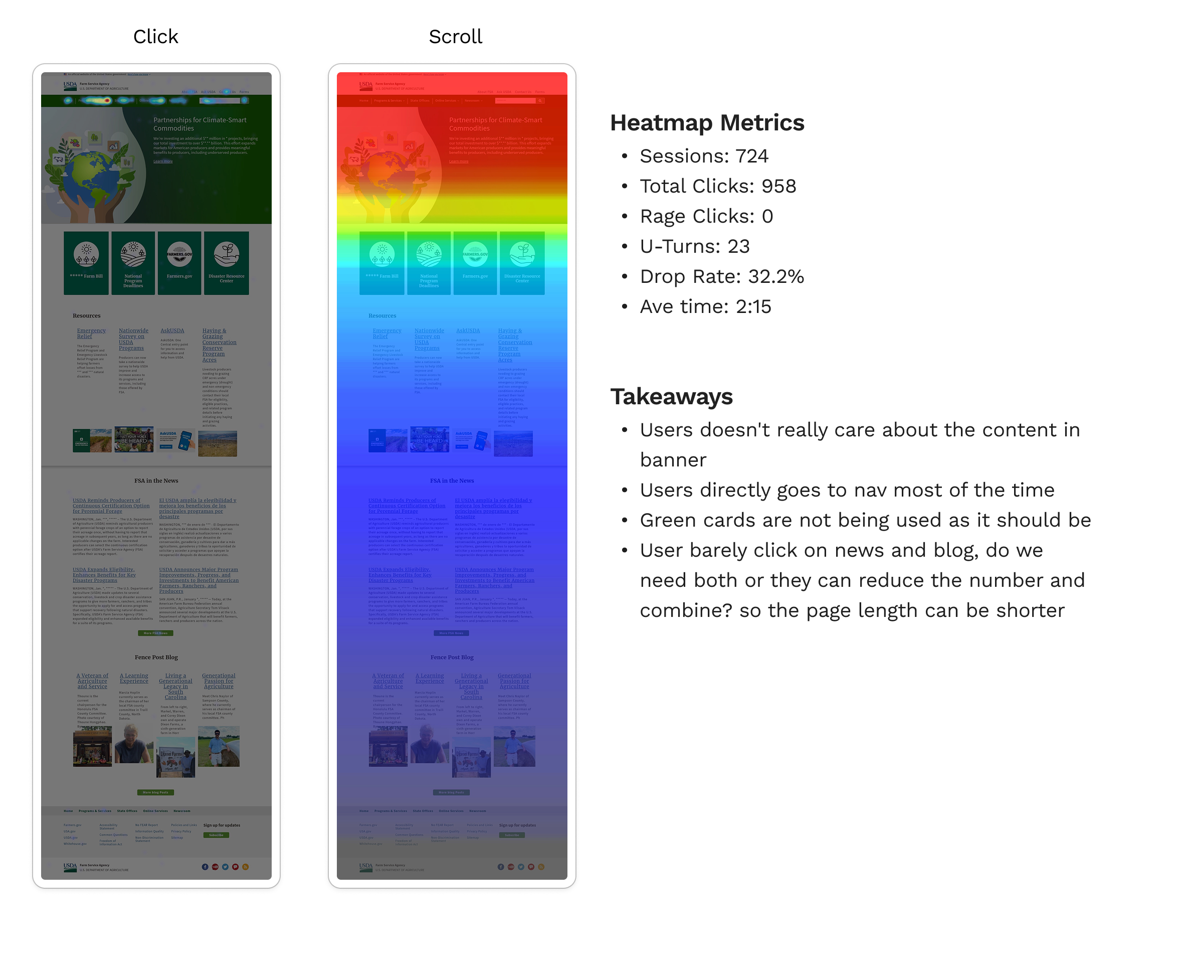
Google Analytics - Behavior data confirmed that users struggled to locate program information efficiently.
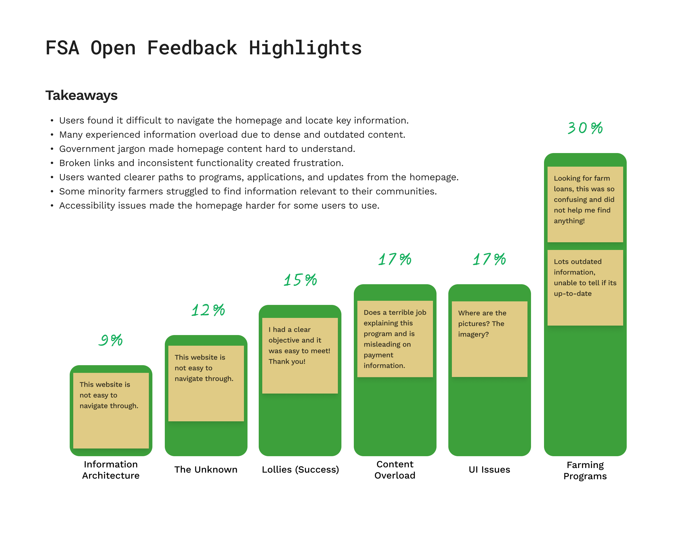
Qualtrics open feedback - Farmers frequently reported relying on search because it was difficult to navigate directly from the
KEY DESIGN DECISIONS_
To address the usability issues identified in research, the homepage was redesigned with three key priorities:
- Surface high-priority content immediately Program categories and common farmer tasks were placed at the top of the page so users could access key information without navigating deep into the IA.
- Establish clear visual hierarchy Content was reorganized into distinct sections, making it easier for farmers to quickly scan and identify relevant resources.
- Create a consistent experience across FPAC sites The homepage applied the new FPAC design system to align visual patterns and interactions across agency websites.
OUTCOME_
The redesigned homepage launched as part of the broader FSA site modernization.
One year after launch, engagement metrics showed significant improvements in discoverability:
- Impressions increased by 322%
- Clicks increased by 248%
These gains indicated that users were finding and engaging with program information more easily.
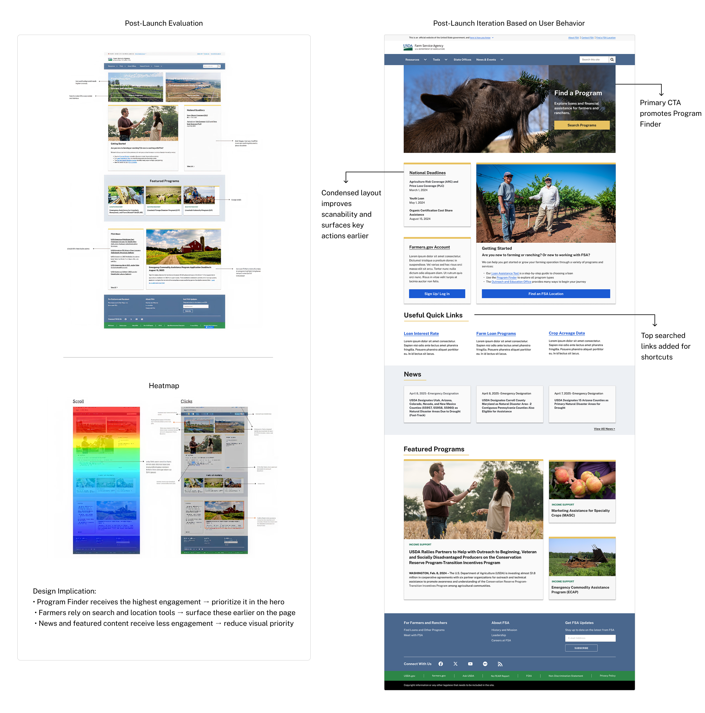
POST-LAUNCH ITERATION_
While the redesigned homepage improved discoverability, post-launch evaluation revealed opportunities to further strengthen visual hierarchy and surface high-priority actions more prominently. The revised design was approved by stakeholders, though it was not implemented due to the contract ending.
NRCS DESIGN EXPORTATION_As part of the FPAC modernization effort, we explored improvements to key NRCS content areas, including Soil Health, Programs & Initiatives, the Homepage Social Media section, and the Payment Schedule page.
The goal was to better understand how farmers access conservation information and identify opportunities to make these resources easier to find and use.Our research surfaced several usability challenges, including dense content, unclear distinctions between programs and initiatives, and important information buried within long pages. Based on these findings, we developed recommendations and mockups to improve content hierarchy, page scannability, and discoverability.
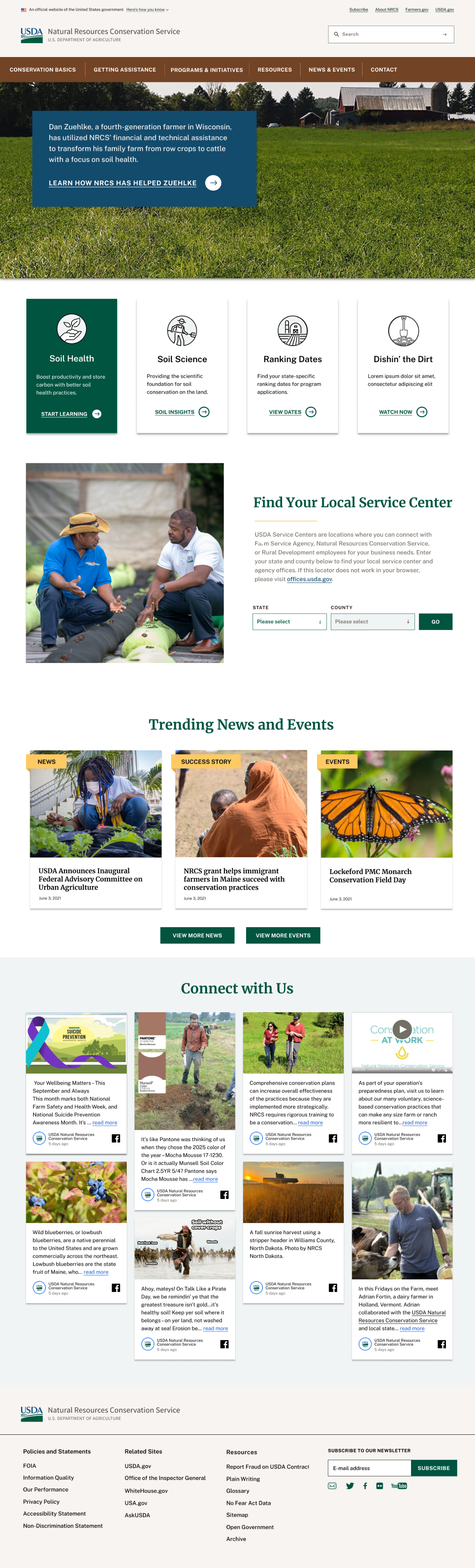
HOMEPAGE SOCIAL MEDIA_I led research to evaluate the value of adding a social media section to the NRCS homepage. The goal was to surface Success Stories and News already shared on social media, allowing users to stay informed about updates, events, and announcements without needing to leave the website.
I first analyzed Facebook post types, posting frequency, and engagement to understand whether a social media presence on the homepage would provide meaningful value, and whether NRCS might benefit from a dedicated social media page.|
Next, I mapped user flows to explore how users might move between NRCS and social platforms—both from social media to the NRCS website and from NRCS back to individual posts.
Based on these insights, I conducted comparative research across government and organizational websites to identify patterns and design approaches for integrating social content into a homepage experience. This informed an initial design exploration for how a social media module could appear and function on the NRCS homepage.
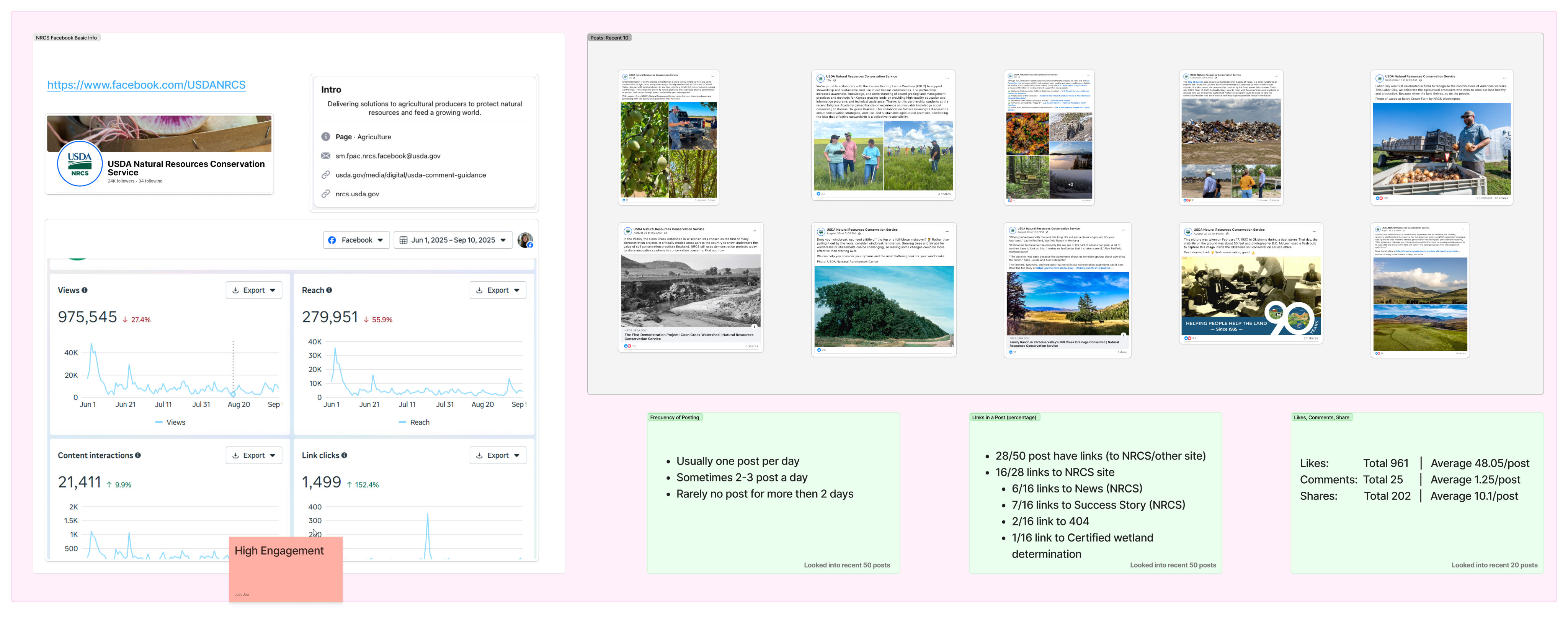
Facebook Analytics Review
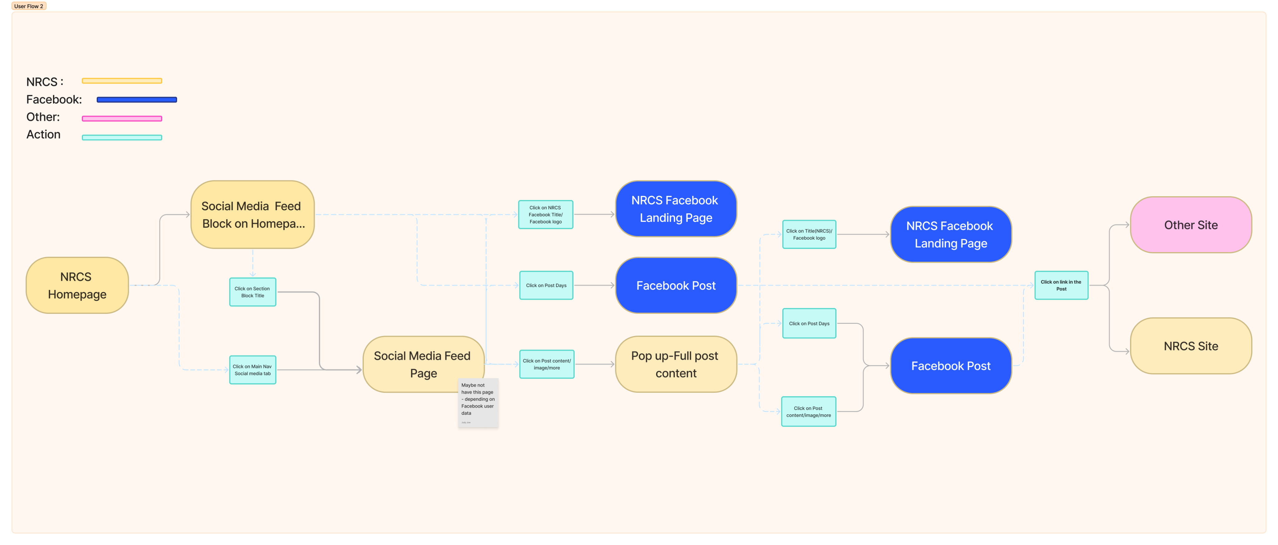
User Flow Exploration
Mock Up - scroll me :)
OTHER BUT_I also supported research synthesis and design exploration for Soil Health and Programs & Initiatives, helping identify opportunities to simplify content structure and improve scannability. Some concepts were explored through early mockups but did not move forward to stakeholder review due to project timeline shifts.