MY ROLE_ Product Designer
DURATION_
3 weeks (2022)
WHAT I DID_UX research Recommendations mock up
THE CHALLENGE_Healthcare institutions compete heavily for skilled professionals. In this environment, employer branding and frictionless application flows directly impact talent acquisition.
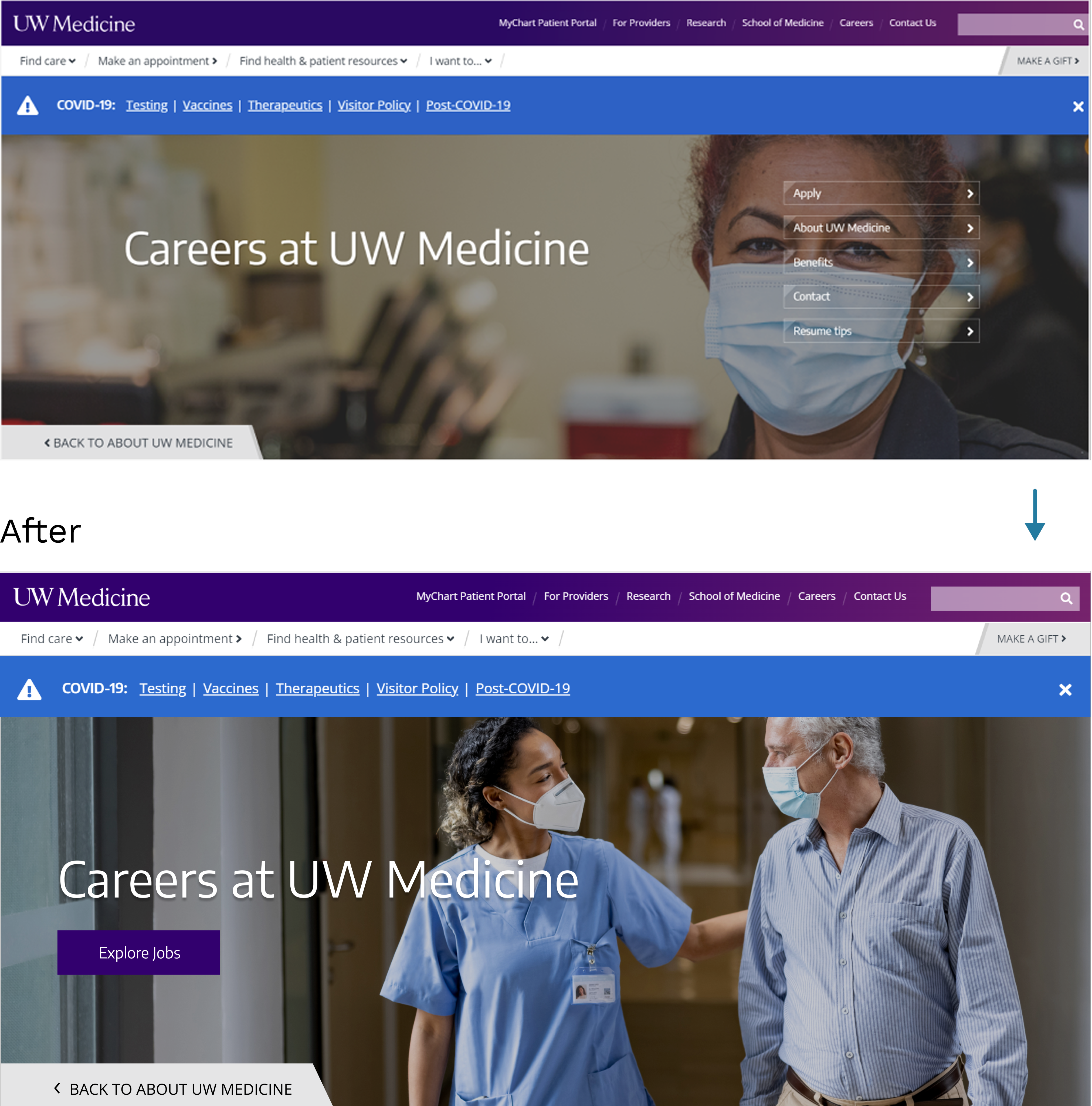
UW Medicine’s careers landing page was not effectively communicating:
Why someone should work there
What differentiates them
How to confidently take the next step
At the time of design, UW Medicine was already planning a redesign by an external UX agency, placing our team’s work in an influential, advisory role rather than full implementation.
STRATEGIC INSIGHT_Rather than designing more content, I focused on impact through structure:
“People decide whether to join an organization before they decide whether to apply.”
So I asked:
- What motivates applicants?
- How can we reduce cognitive load?
- How might we clarify both the value of working here and the next action?
APPROACH_1. User Motivation (Qualitative)
From interviews, top drivers were:
- Growth opportunities
- Compensation & location
- Organizational reputation
→ These became key content pillars.
2. Usability Barriers
We observed:
- Buttons didn’t clearly lead to action
- Benefits weren’t recognizable or differentiated
- Users got lost in navigation
→ This informed a redesigned visual hierarchy.
3. Competitive Benchmarking
Compared to peers like Overlake Hospital and Kaiser Permanente, UW Medicine lacked:
- Clear brand narrative on the career page
- Scannable career categories
- A strong “why work here” section
→ This shaped our prototype framework.
DESIGN DECISIONS_
🧭 Clarify Path to Action
- Primary CTA labeled “Explore Jobs” in the hero
- Reduced CTA noise by eliminating duplicate buttons
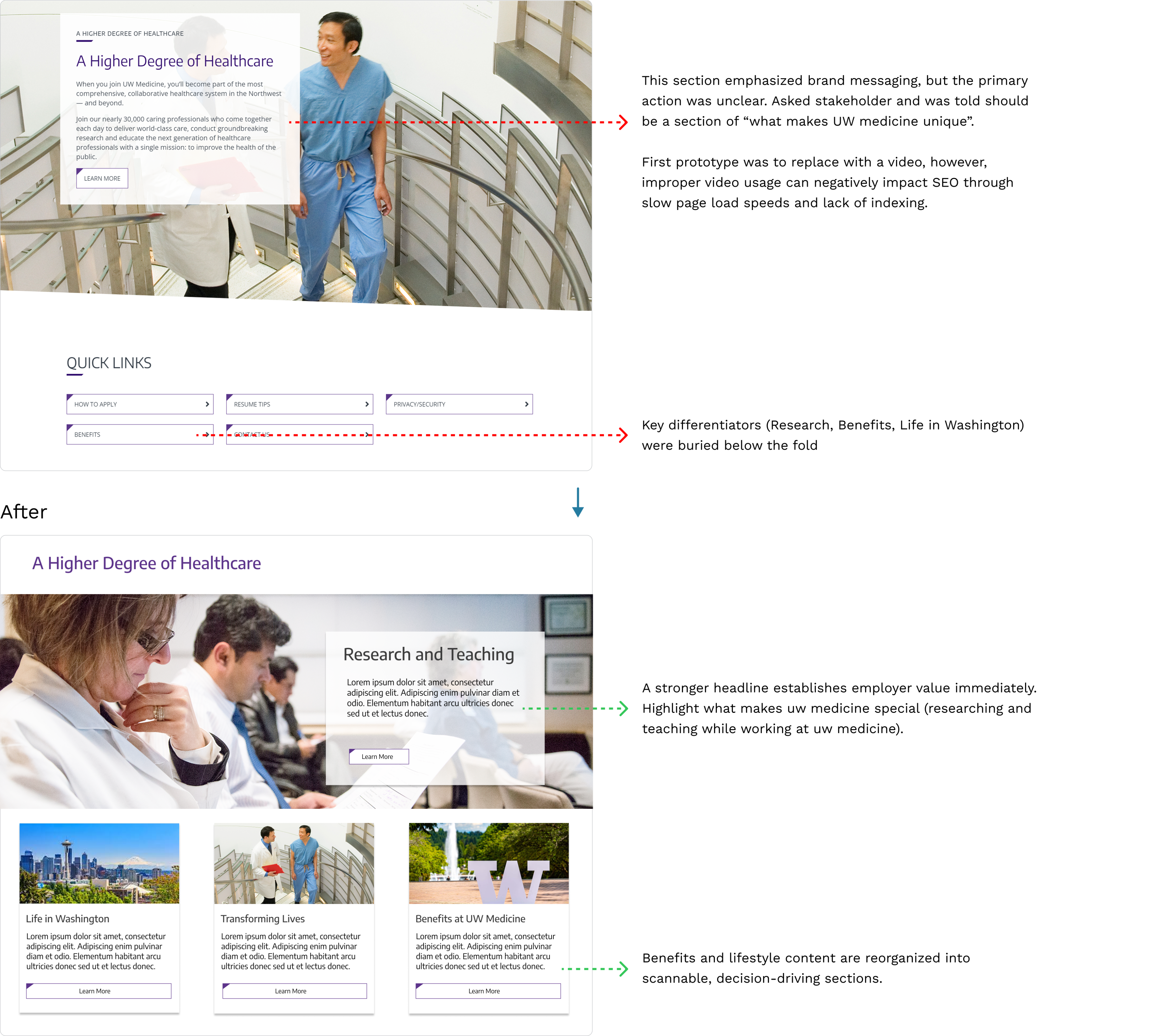
🧠 Reframe Benefits as Decision Drivers
- Highlighted lifestyle and career growth perks
- Distilled into prioritized blocks based on what users cared about most
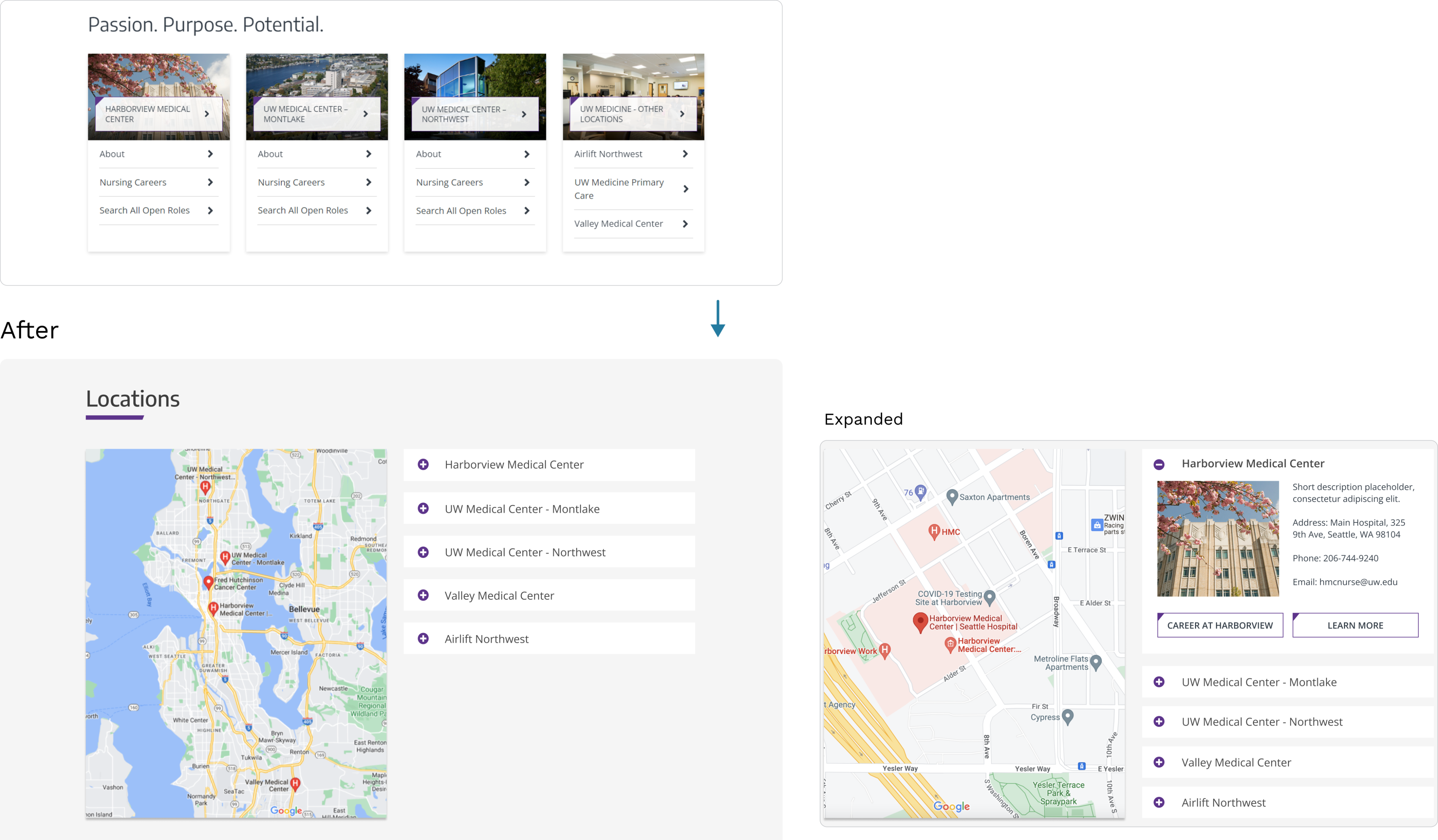
📍 Improve Location Transparency
- Interactive map with labeled facilities
- Precise addresses and commute hints
- Reduced clicks to reach location-specific listings
OUTCOME & METRICS_
Though we didn’t deploy the final product, we received positive feedback. Our recommendations were delivered to UW Medicine stakeholders and passed to the external UX agency for consideration and future implementation.
The direction of the live UW Medicine careers page strongly reflects our findings and recommendations:
- Clear, motivational headline (“Where your impact goes further”)
- Direct job search entry at top navigation
- Featured perks and benefits pulled into primary content
- Segmented career categories by function
Outcome Estimate: A cleaner career entry point and persuasive value messaging likely increased click-through to job search (even before people drill into individual listings) — a meaningful uplift in conversion potential.